
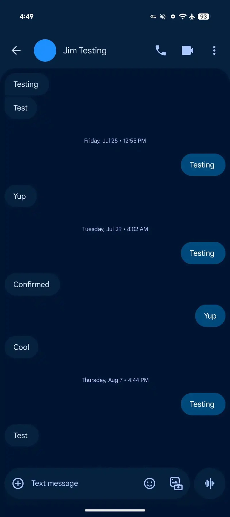
The old design on the left vs the new one on the right. | Image credit – 9to5Google
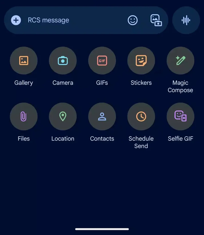
Those playful wallpapers? They’ve been swapped for solid backgrounds in both light and dark modes, which makes scrolling through conversations feel a lot cleaner and more refined.
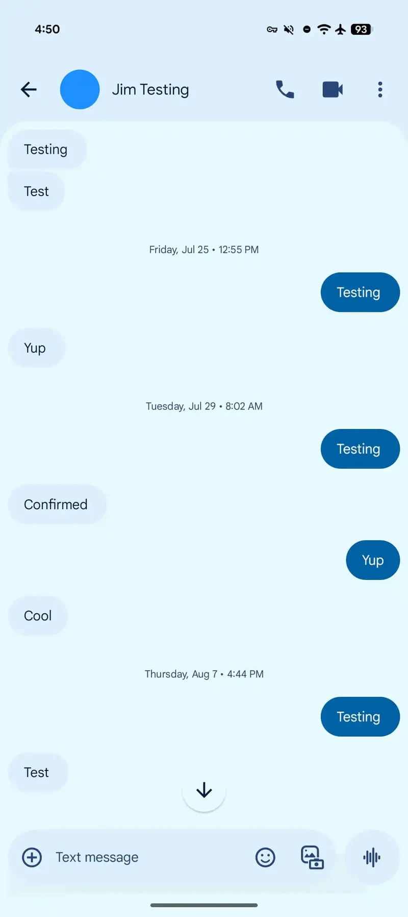
The new design in dark and light mode. | Image credit – 9to5Google
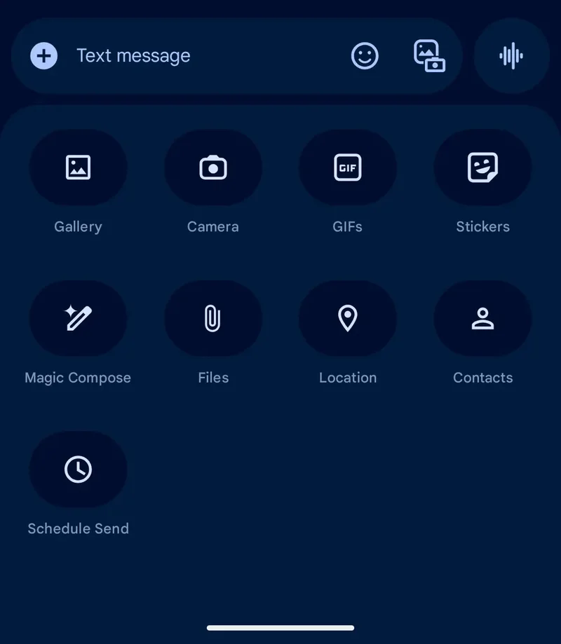
The expressive media picker also got a redesign. A flexible button group at the top now morphs depending on what kind of media you’re working with. The search bar has been moved down, avoiding awkward back-to-back text fields, and Photomoji has been toned down a bit so other media options get more attention.
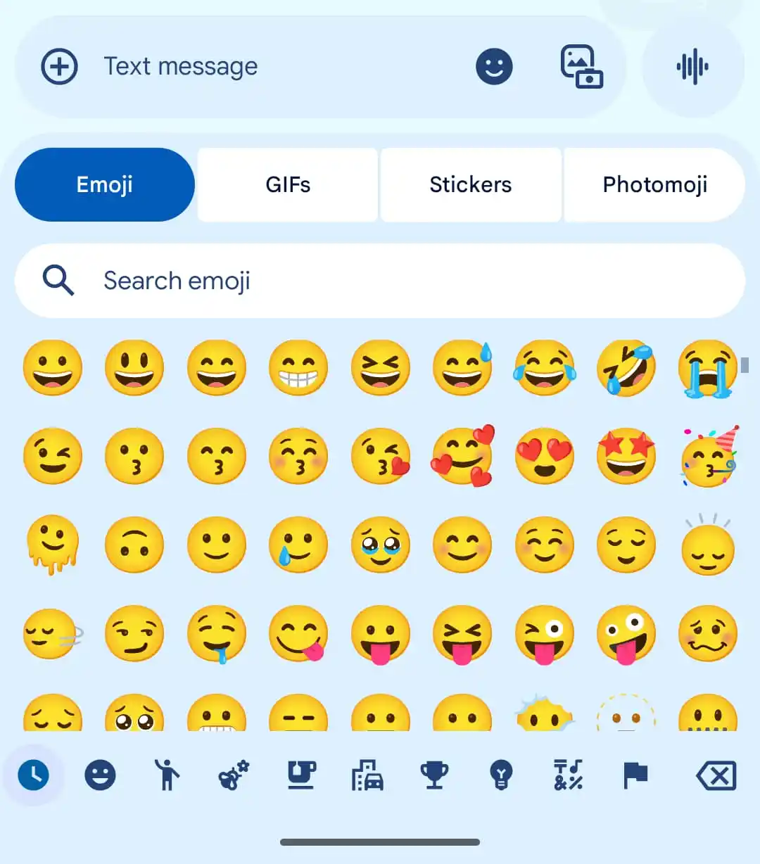
The expressive media picker also got a redesign. | Image credit – 9to5Google
While this rollout seems like the final visual step of Messages’ long redesign, there is more going on under the hood. The latest beta, for example, hints that Google is starting to roll out QR code-based key verification, a security feature that ensures you are actually talking to the person you think you are. It is a small but important addition as messaging security becomes increasingly important.
All these changes together give Google Messages a fresh, modern feel without sacrificing functionality. Cleaner visuals, smarter media tools, and better security should make it easier – and safer – for users to keep chatting without feeling like the app is stuck in the past.

“Iconic Phones” is coming this Fall!
Good news everyone! Over the past year we’ve been working on an exciting passion project of ours and we’re thrilled to announce it will be ready to release in just a few short months.
LEARN MORE AND SIGN UP FOR EARLY BIRD DISCOUNTS HERE
#Google #Messages #app #shedding #colorful #skin #refined